What makes a good landing page?
Anyone can whack a few words together and throw them with some screenshots into a webpage. Does that make a landing page?
Not always. Trevor, CrowdTamers’ founder, recently critiqued quite a few landing pages and what he did may have seemed arbitrary, but there are actually a few simple rules to building a good LP.
When you’re writing for a landing page, you have to bear in mind what the goal of your landing page is – whether it is to drive traffic or increase conversions. There’s much more to writing copy for an effective landing page. With this in mind, your copy has to sell the offer in a way that shows that your product is the best thing to address your audience’s needs.
We love using landing pages to test crazy ideas out because a well-built landing page lets you validate your entire go-to-market approach.
So what does a landing page need to be “well built”?
The ideal landing page has:
- An attention-grabbing headline
- Explanatory Body copy
- Social proof 1×2
- CTA
- Benefits
- Process – How it works
- Who it’s for
- CTA
- Pricing
The attention-grabbing headline
What is the single most important value that your product offers? That’s the main focus of this headline. The goal here is to show not tell. For example instead of:
‘The best courses your team needs’ try something along these lines ‘Courses that transform teammates into champions’.
The latter speaks to the concern that most managers have when leading their teams. As opposed to the former which speaks to the features of your product.
Your headline is the most essential part of your landing page because it’s the first thing your reader sees and it is what hooks them and keeps them reading. You need to know what challenges your audience faces and how your product solves these problems for them. So when writing your headline, craft it as a solution to the problem your audience currently faces.
Short explainer copy
Coming in closely after your headline, this area delves deeper into the finer details of how your product makes life better and easier for your client. A sort of explainer to your headline, it paints a picture of a life where your client no longer has to worry about their problem; convincing them to try out said product/service. It shouldn’t be too long: 5 short sentences should do the trick.
Bring the Social Love
Testimonials are powerful for several reasons:
- People trust people and are more likely to pay attention when they see reviews from real people like them.
- Testimonials from satisfied clients are always a bonus. It shows that your product is tried, tested, and trusted – like a personal recommendation.
- Your customers are usually the best copywriters for your business
So find your best two quotes – that show how your product has solved a problem for them or taken them out of a difficult situation. Don’t forget to add your speaker’s name and any other details that you consider relevant (age, job title, or organization) for added context.
Added bonus: if you can link directly to a tweet or other social post from a customer, it really proves you didn’t write it yourself.
Create a clear Call-to-Action On your Landing Page
What do you want your audience to do? Would you like them to ‘Book A Call’ or ‘Try a Demo’?
You want your page visitors to know what to do after they’ve read your content which is why your CTA must be clear and easy to spot. The more direct your call to action is, the better it’ll work for your conversion rates—and you want to minimize your CTAs so that there’s only one on any given screen.
Also, think about mobile screens and how CTAs will look there. It’s wild how often mobile browsing is clearly an afterthought in 2022.
Benefits of Product/Service
Remember that people don’t buy products—they buy benefits.
A well-written landing page will clearly outline these benefits. The famous saying is “People don’t want a one-inch drill. they want a one-inch hole.”
Talk about the holes your customer can drill, not the drillbit you made.
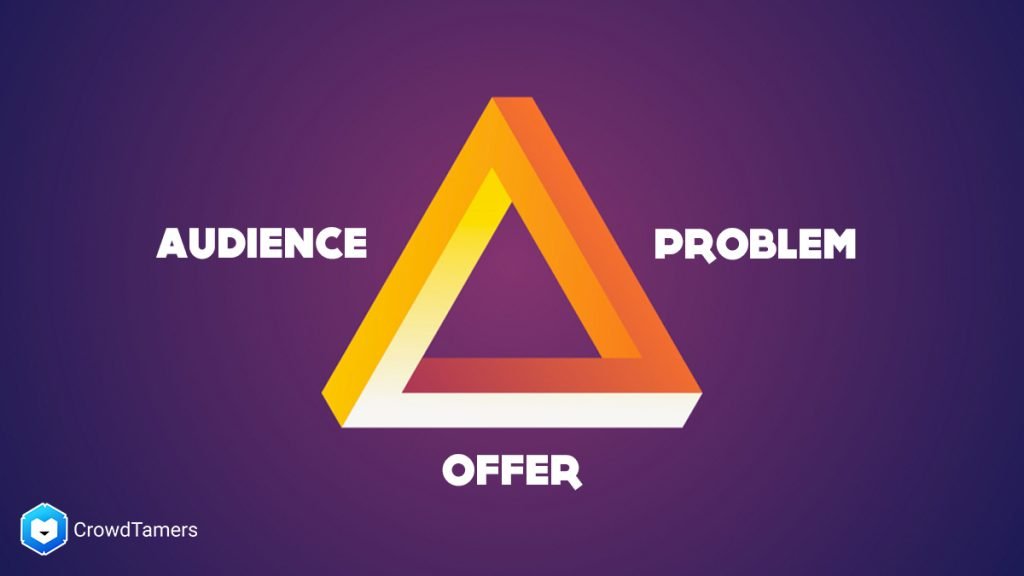
Different users will need different benefits; we often talk about the triangle of “Audience, Problem, Offer” and how those 3 different sides of the triangle need to be in balance. Your landing page is an easy place to test out differences in the 3 sides of your Go To Market positioning, so think carefully about what you’re selling and to whom when you’re writing any page.
How it works
You can finally talk about features here!
Once someone has understood what your product does, you’ll need to anchor those benefits with some features that show how you can achieve those benefits.
Again, when you’re switching up your audience, problem, or offer on a landing page you need to make sure that the features overview addresses their features, not some generic set you wrote 6 months ago.
Common here will be screenshots of your product, if you have a finished one, or barring that you can have mockups of the product and how it will work.
Who is it for?
Which audience is this product for? Who is the primary and secondary audience? It’s easy to make assumptions that your audience knows who your product is for. This section helps give context to the reader.
If different professionals across industries can use your product/service, this is where you state it. You can go about this in two ways:
- You can speak directly to who it is for. An example is ‘HR professionals’ or ‘Aspirational career professionals.’
or
- You can address it from the pain point – ‘Professionals looking for getting career coaching’ or ‘HR executives looking for better career development programs for their teams.
The second, when properly written, will speak to a broader audience that shares the same pain point without limiting them to a particular demographic. So this is helpful to give context to the reader.
Again, less is more, so 1-3 is ideal, but no more than four at the maximum.
Bring back your CTA
We’re bringing this back because we want to remind the viewer to take action. So ‘Book Now,’ ‘Book a Demo’ button – preferably same as above. Our good friends at Unbounce delve deep into writing the best CTAs for your landing page.
Should your landing page have a pricing slide?
Pricing is often a separate page. However, if you’re testing GTM or positioning at once, it’s handy to validate if your audience is willing to pay $X for your offer to solve their problem.
It’s pretty common to offer multiple pricing tiers. For instance, you could use usage gating (like number of seats) or feature gating (like “the cool feature everyone wants”. It’s important to note however, that it’s not in the basic pricing tier).
Those are the parts to a minimum viable page. A well-crafted landing page can make all the difference in generating conversions for your product or service. This is a basic list, there are other things to do and avoid when creating a landing page. You should take note of what these things are so you can optimize your page for the best results. So feel free to move things around or even add a little something. These elements broadly are the minimum you can develop and still lead your buyer on an understandable journey once they’ve reached your page.